Record card
The following additional points can be added to the record card:
New Drop-Down Menu Item
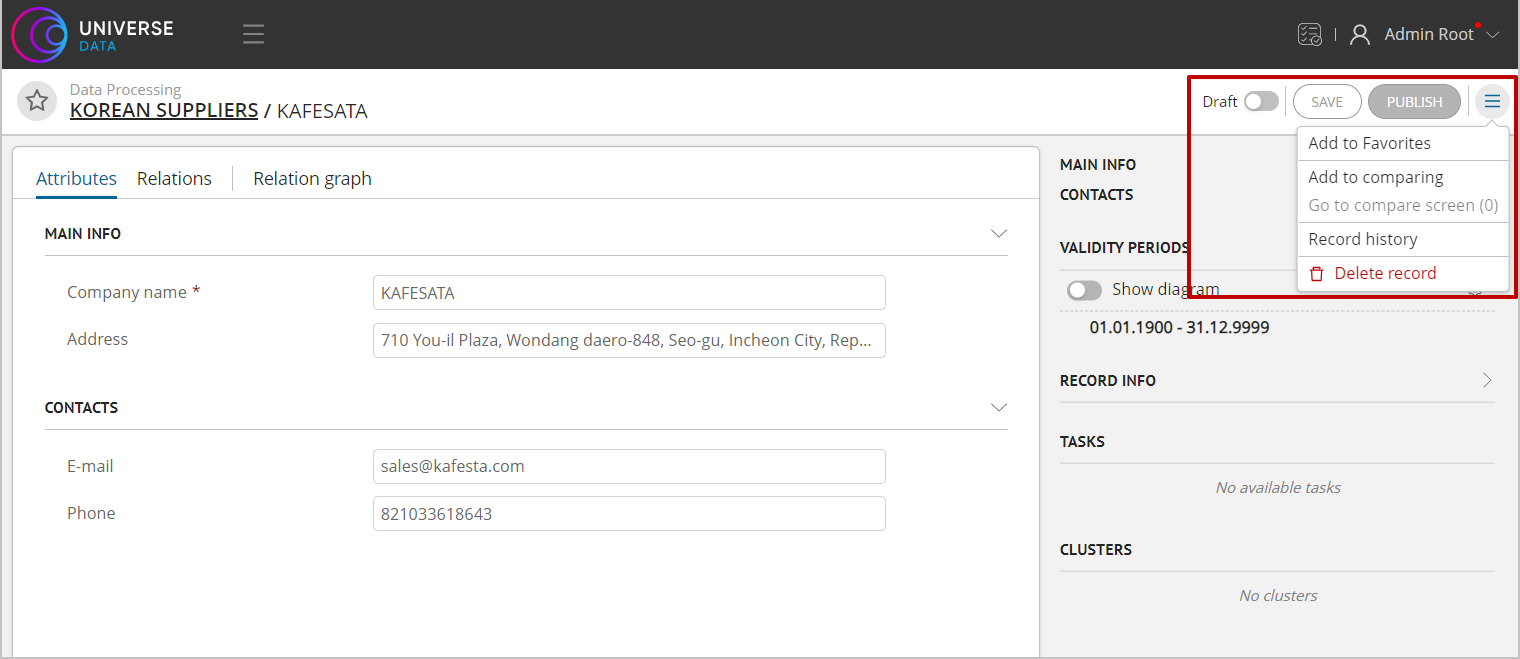
Figure 1. Drop-down menu
UEDataCardMenuItem is designed to add menu items to the record card. Accepts AbstractCardStore in the resolver, so that certain elements can be added/excluded using the implementation of a certain storage class.
Example UEDataCardMenuItem
import {INamespaceDataRecord, UeModuleBase} from '@unidata/core-app';
import {ComponentType} from 'react';
import {AbstractCardStore} from '../../store';

type DataCardMenuProps<T extends INamespaceDataRecord> = {
    dataCardStore: AbstractCardStore<T>;
}

export type UEDataCardMenuItem<T extends INamespaceDataRecord> = UeModuleBase & {
    default: {
        component: ComponentType<DataCardMenuProps<T>>; // the component that will be rendered in place of the button.
        meta: {
            menuGroupId: string; // specifying a group to separate menu items
        };
        resolver: (dataCardStore: AbstractCardStore<T>) => boolean; // a function that determines in which case to show the button (depending on the state of the card)
    };
}
Realisation: "Record History", which is displayed only in published records.
interface IProps {
    dataCardStore: DataCardStore;
}

export class HistoryMenuItem extends React.Component<IProps> {
    openHistoryPage = () => {
        const dataCardStore = this.props.dataCardStore;
        const etalonId = dataCardStore.etalonId;

        if (etalonId) {
            dataCardStore.routerStore.setRoute(RouteKeys.RecordHistoryPage, {
                namespace: dataCardStore.namespace,
                entityName: dataCardStore.typeName,
                etalonId: etalonId
            });
        }
    }

    override render () {
        return (
            <DropDown.Item onClick={this.openHistoryPage}>
                {i18n.t('module.data>history>recordHistory')}
            </DropDown.Item>
        );
    }
}

export const historyButtonUE = {
        'default': {
            type: UEList.DataCardMenuItem,
            moduleId: 'history',
            active: true,
            system: false,
            component: HistoryMenuItem,
            resolver: (dataCardStore: AbstractCardStore<any>) => {
                return dataCardStore instanceof DataCardStore &&
                    dataCardStore.draftStore?.draftId === undefined;
            },
            meta: {
                menuGroupId: DataCardMenuGroupName.history
            }
        }
    };
New Record Card Tab
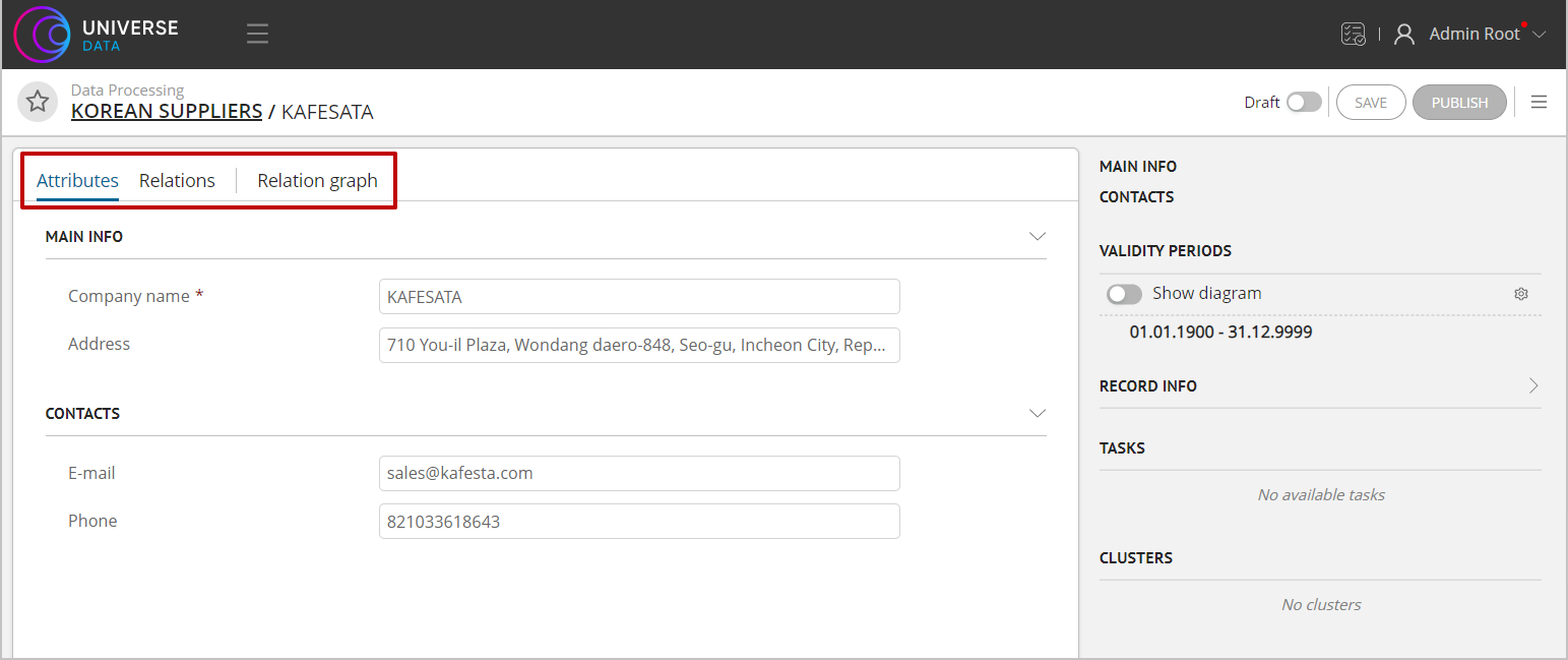
Figure 2. New tab
UEDataCardTabItem is designed to add tabs on the record card.
The current tabs of attributes, links, etc. are linked to the DataCardStore in the resolver. If you inherit from AbstractCardStore, you need to prepare the contents of the tab yourself.
Example of UEDataCardTabItem
type DataCardTabItemProps<T extends INamespaceDataRecord> = {
    dataCardStore: AbstractCardStore<T>;
}

export type UEDataCardTabItem<T extends INamespaceDataRecord> = UeModuleBase & {
    default: {
        component: ComponentType<DataCardTabItemProps<T>>; // the component that renders the contents of the tab
        meta: {
            tab: TabItem; // tab description (display name, key, etc.)
            position: 'left' | 'right'; // the ability to add tabs both to the general list and on the right side of the card
        };
        resolver: (dataCardStore: AbstractCardStore<T>) => boolean; // a function that determines in which case to show the button (depending on the state of the card)
    };
}
Realisation:
export const relationGraphUE: UEDataCardTabItem<DataRecord> = {
    'default': {
        type: UEList.DataCardTabItem,
        moduleId: 'relationGraph',
        active: true,
        system: false,

        component: RelationGraphTabItem, // component that renders relations graph
        meta: {
            tab: {
                key: 'relationGraph',
                tab: i18n.t('module.data-ee>ue>relationGraph>tabLabel'),
                order: 30
            },
            position: 'left'
        },
        resolver: (dataCardStore: AbstractCardStore<DataRecord>) => {
            return dataCardStore instanceof DataCardStore &&
                MetaTypeGuards.isEntity(dataCardStore.metaRecordStore.getMetaEntity()) && Boolean(dataCardStore.etalonId) &&
                dataCardStore.draftStore?.draftId === undefined;
        }
    }
};
Adding Сontent on Right Sidebar
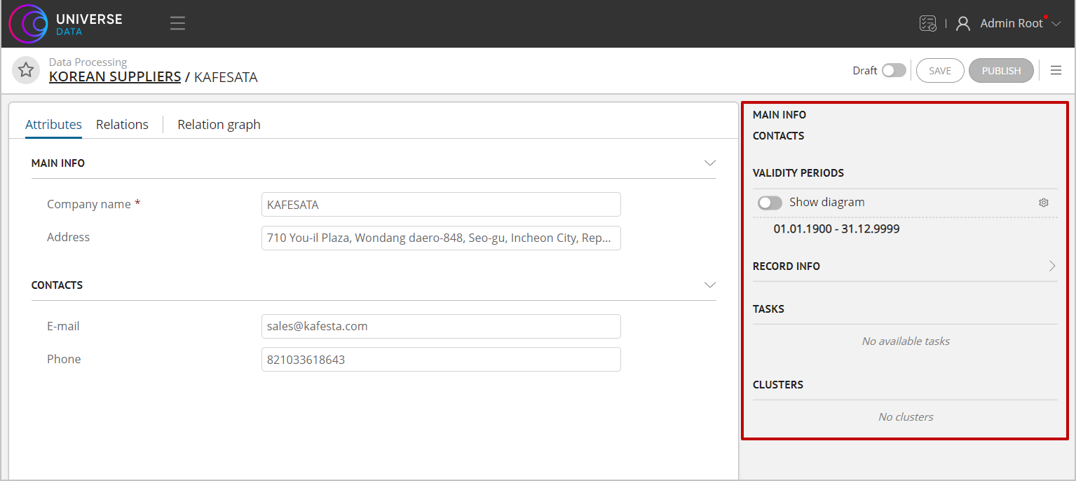
Figure 3. Right side panel
UEDataCardSidePanelItem is designed to display controls to the right of the record card.
Action periods, clusters, tasks are custom extension points of the UEDataCardSidePanelItem type.
At the moment, they are not tied to the storage type and will be available for all possible records. This behavior can be changed according to the requirements of the project.
Example of UEDataCardSidePanelItem
type DataCardSidePanelItemProps<T extends INamespaceDataRecord> = {
    dataCardStore: AbstractCardStore<T>;
}

export type UEDataCardSidePanelItem<T extends INamespaceDataRecord> = UeModuleBase & {
    default: {
        component: ComponentType<DataCardSidePanelItemProps<T>>; // The component that renders the contents of the panel
        meta: {
            order: number; // panel sequence
        };
        resolver: (dataCardStore: AbstractCardStore<T>) => boolean; // a function that determines in which case to show the button (depending on the state of the card)
    };
}
Realisation:
export const clusterWidgetUE: UEDataCardSidePanelItem<any> = {
    'default': {
        type: UEList.DataCardSidePanelItem,
        moduleId: 'dataRecordClusters',
        active: true,
        system: false,
        component: ClustersWidget, // panel content component
        resolver: (dataCardStore: AbstractCardStore<any>) => {
            return Boolean(dataCardStore.etalonId); // display only if there is an EtalonId of the record
        },
        meta: {
            order: 20
        }
    }
};
Displaying Attribute in Record Card
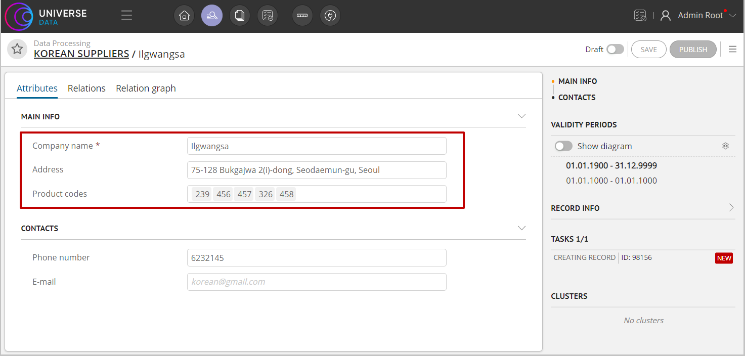
Figure 4. Displaying simple attributes and array attributes
The extension point UEAttributePreview is responsible for displaying attributes in the record card (Figure 4).
UEAttributePreview
import {INamespaceMetaModel, UeModuleBase} from '@unidata/core-app';
import {ComponentType} from 'react';
import {AbstractAttribute, UPathMetaStore} from '@unidata/meta';
import {AbstractModel} from '@unidata/core';
import {ArrayAttributeStore} from '../../page/dataview_light/dataviewer/card/attribute/store/ArrayAttributeStore';
import {SimpleAttributeStore} from '../../page/dataview_light/dataviewer/card/attribute/store/SimpleAttributeStore';
import {AbstractDataEntityStore} from '../../page/dataview_light/store/dataEntity/AbstractDataEntityStore';

type AttributePreviewProps = {
    attributeStore: SimpleAttributeStore | ArrayAttributeStore;
    dataEntityStore: AbstractDataEntityStore;
    metaEntityStore: UPathMetaStore<INamespaceMetaModel>;
}

export type UEAttributePreview = UeModuleBase & {
    default: {
        component: ComponentType<AttributePreviewProps>; // component for render Attribute
        meta: {
            name: string;
            displayName: () => string;
        };
        resolver: (attribute: AbstractAttribute, model: AbstractModel) => boolean;
    };
}
Displaying Custom Attribute in Record Card
UERenderAttributeOnDataCard is designed for custom attribute display in the record card.
Description UERenderAttributeOnDataCard
type RenderDataAttributeProps = {
    attributeStore: SimpleAttributeStore | ArrayAttributeStore;
    dataEntityStore: AbstractRecordEntityStore;
    metaEntityStore: UPathMetaStore<IMetaModel>;
}

type Resolver = (attribute: IMetaAbstractAttribute, model: AbstractModel) => boolean;
type Meta = {
    name: string; // Ключ, который используется для настройки вида атрибута в метамодели.
    previewOptions?: string [];
    displayName: () => string;
    additionalProps?: {type?: string};
};

export type UERenderAttributeOnDataCard = UeModuleBase<Resolver, Meta> & {
    component: ComponentType<RenderDataAttributeProps>;
}
Implementation example:
type UERenderAttributeOnDataCard = UniverseUE.IUeMeta['RenderAttributeOnDataCard'];

// Описание UE
const simpleType: UERenderAttributeOnDataCard = {
    moduleId: 'customStringAttribute',
    active: true,
    system: false,
    component: MyCustomAttribute, // Сомпонент с логикой
    resolver: (attribute: AbstractAttribute, model: AbstractModel) => {
        return MetaTypeGuards.isAbstractSimpleAttribute(attribute) &&
            attribute.typeCategory === AttributeTypeCategory.simpleDataType &&
            attribute.simpleDataType.getValue() === SIMPLE_DATA_TYPE.STRING;
    },
    meta: {
        name: 'default',
        displayName: () => i18n.t('module.record>dataview>defaultView'),
        additionalProps: {type: 'string'}
    }
};
Example of a file with a component MyCustomAttribute:
import * as React from 'react';
import {observer} from 'mobx-react';
import {computed} from 'mobx';
import {Input} from '@universe-platform/uikit';
import {i18n} from '@universe-platform/sdk';
import {IMetaModel, UPathMetaStore, AbstractRecordEntityStore, SimpleAttributeStore} from '@universe-platform/sdk-mdm

   interface IProps {
       attributeStore: SimpleAttributeStore;
       dataEntityStore: AbstractRecordEntityStore;
       metaEntityStore: UPathMetaStore<IMetaModel>;
       type: 'string' | 'number' | 'integer';
   }

   @observer
   export class MyCustomAttribute extends React.Component<IProps> {

       get store () {
           return this.props.attributeStore;
       }

       get inputMode () {
           if (this.props.type === 'integer') {
               return 'numeric';
           } else if (this.props.type === 'number') {
               return 'decimal';
           }

           return 'text';
       }

       @computed
       get attribute () {
           return this.props.attributeStore.getDataAttribute();
       }

       onTextChange = (e: React.ChangeEvent<HTMLInputElement>) => {
           let value = e.target.value;

           this.setAttributeValue(value);

       };

       onNumberChange = (valueArg: number | undefined) => {
           const value = valueArg === undefined ? null : valueArg;

           this.setAttributeValue(value);
       };

       setAttributeValue (value: string | number | null) {
           this.props.attributeStore.setAttributeValue(value);
       }

       getPlaceholder (readOnly: boolean, type: string = 'text') {
           if (readOnly) {
               return i18n.t('module.record>dataview>valueUnset');
           }

           if (type === 'number') {
               return i18n.t('module.record>dataview>enterNumber');
           } else if (type === 'integer') {
               return i18n.t('module.record>dataview>enterInteger');
           } else {
               return i18n.t('module.record>dataview>enterText');
           }
       }

       private renderNumberInput () {
           const value = Number.parseFloat(this.attribute.value.getValue()) || undefined;
           const errorMessage = i18n.t(this.attribute.getErrorMessage('value'));
           const readOnly = this.store.getReadOnly() || !this.store.getIsEditMode();
           const placeholder = this.getPlaceholder(readOnly, this.props.type);

           return (
               <Input.Number
                   value={value}
                   onChange={this.onNumberChange}
                   hasError={Boolean(errorMessage)}
                   errorMessage={errorMessage || undefined}
                   isInteger={this.inputMode === 'numeric'}
                   inputMode={this.inputMode}
                   autoFocus={true}
                   allowClear={true}
                   placeholder={placeholder}
                   onBlur={this.store.setEditModeOff}
               />
           );
       }

       private renderTextInput () {
           const errorMessage = i18n.t(this.attribute.getErrorMessage('value'));
           const readOnly = this.store.getReadOnly() || !this.store.getIsEditMode();
           const placeholder = this.getPlaceholder(readOnly, this.props.type);

           return (
               <Input
                   value={this.attribute.value.getValue()}
                   onChange={this.onTextChange}
                   hasError={Boolean(errorMessage)}
                   allowClear={true}
                   errorMessage={errorMessage || undefined}
                   inputMode={this.inputMode}
                   autoFocus={true}
                   placeholder={placeholder}
                   onBlur={this.store.setEditModeOff}
               />
           );
       }

       override render () {
           if (this.props.type === 'number' || this.props.type === 'integer') {
               return this.renderNumberInput();
           }

           return this.renderTextInput();
       }
   }
Example of setting up a UE for a custom representation of an attribute of a certain type (for example, String)
type UERenderAttributeOnDataCard = UniverseUE.IUeMeta['RenderAttributeOnDataCard'];

// Описание UE
const simpleType: UERenderAttributeOnDataCard = {
    moduleId: 'customStringAttribute',
    active: true,
    system: false,
    component: MyCustomAttribute, // Сомпонент с логикой
    resolver: (attribute: AbstractAttribute, model: AbstractModel) => {
        return MetaTypeGuards.isAbstractSimpleAttribute(attribute) &&
            attribute.typeCategory === AttributeTypeCategory.simpleDataType &&
            attribute.simpleDataType.getValue() === SIMPLE_DATA_TYPE.STRING;
    },
    meta: {
        name: 'some_custom_view', // произвольный ключ, он и displayName будут использоваться в поле `вид` в метамодели в настройке атрибута
        displayName: () => 'Название этого представления атрибута',
        additionalProps: {type: 'string'}
    }
};
How the application selects attributes from the UE to be drawn on the card
If you select the type of attribute in the data model, then in its custom_properties in the DATACARD_ATTRIBUTE_TYPE field, the value from the name field of the meta section of the UE attribute settings will be written. Thus, this value is involved in filtering the desired view as shown below.
// const metaAttribute: AbstractAttribute;
// const store: SimpleAttributeStore | ArrayAttributeStore;
// ...
const typeCategory = metaAttribute.typeCategory;
const customProperty = metaAttribute.getCustomProperty(AttributeCustomPropertyEnum.DATACARD_ATTRIBUTE_TYPE);

let view = 'default';

if (customProperty) {
    view = customProperty.value.getValue();
}

if (!typeCategory) {
    return null;
}

const ueAttributes = ueModuleManager.getResolvedModulesByType('RenderAttributeOnDataCard', [
    this.metaAttribute,
    this.metaEntityStore.getMetaEntity()
]);

let ueAttribute = ueAttributes.find((module) => {
        return module.meta.name === view;
    }) ||
    ueAttributes.find((module) => {
        return module.meta.name === 'default';
    });
Displaying Complex Attribute Section
The extension point UEComplexAttributeSection is responsible for displaying a section with complex attributes.
UEComplexAttributeSection
type Props = {
    allowChangeView: boolean; // indicates whether it is allowed to change view to table
    allowModalForNested?: boolean;
    dataPath: string;
    metaPath: string;
    isNavigable: boolean;
    title: string;
    attrLabelWidth?: number;
    attrLabelPosition?: LabelPosition | string;
    dataEntityStore: AbstractRecordEntityStore;
    metaEntityStore: UPathMetaStore<IMetaModel>;
    navigableItemsStore?: NavigableItemsStore;
    dataCardStore: AbstractCardStore<IRecordEntity>;
}

type Resolver = (group: RecordCardGroupLayoutItem, dataCardStore: AbstractCardStore<IRecordEntity>) => boolean;

export type UEComplexAttributeSection = UeModuleBase<Resolver, {}> & {
    component: ComponentType<Props>;
}
Example of using UEComplexAttributeSection
ueModuleManager.addModule('ComplexAttributeSection', {
    moduleId: 'mdmComplexAttributes',
    active: true,
    system: false,
    component: ComplexAttributeSection, // a component that renders complex attributes on a card
    resolver: (group: RecordCardGroupLayoutItem, dataCardStore: AbstractCardStore<IRecordEntity>) => {
        return group.isComplex;
    },
    meta: {
        order: 10
    }
});
Displaying Element Before Attribute
The extension point UEDataViewElementPrefix is responsible for displaying additional information before attributes on the attributes card. In the platform, it is used to highlight attributes with errors.
Description of UEDataViewElementPrefix
type DataAttributePrefixProps = {
    metaEntity: IMetaModel;
    path: string;
    parentPath?: string;
    type: RecordViewElementType;
    cmpRef: React.RefObject<React.Component>;
    navigableItemsStore?: NavigableItemsStore;
}

type Meta = {
    order: number;
};

export type UEDataViewElementPrefix = UeModuleBase<DefaultUeResolver, Meta> & {
    component: ComponentType<DataAttributePrefixProps>;
}
Example of using UEDataViewElementPrefix
ueModuleManager.addModule('DataViewElementPrefix', {
    moduleId: 'dqErrorIndicator',
    active: true,
    system: false,
    resolver: () => true,
    meta: {
        order: 1
    },
    component: DqErrorIndicatorContainer // компонент, отрисовывающий индикацию ошибок
});
Displaying Tag in Header
UEDataCardTag is designed to add a "tag" to the header of the record card.
Description of UEDataCardTag
type DataCardTagProps<T extends IRecordEntity> = {
    dataCardStore: AbstractCardStore<T>;
}

export type UEDataCardTag<T extends IRecordEntity> = UeModuleBase & {
    default: {
        component: ComponentType<DataCardTagProps<T>>;
        meta: {
            order: number;
        };
        resolver: (dataCardStore: AbstractCardStore<T>) => boolean;
    };
}
Example - UEDataCardTag displaying a tag that a draft record is in the process of approval
interface IProps {
    dataCardStore: AbstractCardStore<any>;
}

@observer
class TagDraftIsDelayed extends React.PureComponent<IProps> {
    override render () {
        const draft = this.props.dataCardStore.draftStore?.selectedDraft;
        const state = draft?.state.selectedItem;

        return (
            <Tag intent={INTENT.INFO} key={'draftTag'}>
                <Tooltip overlay={state?.description.getValue()}>
                    <span>
                        {draft?.state.displayValue}
                    </span>
                </Tooltip>
            </Tag>
        );
    }
}

export const dataCardTagUe: UEDataCardTag<IRecordEntity> = {
    'default': {
        type: UEList.DataCardTag,
        moduleId: 'TagDraftDelayedByWorkflow',
        active: true,
        system: false,
        component: TagDraftIsDelayed,
        resolver: (dataCardStore: AbstractCardStore<IRecordEntity>) => {
            return dataCardStore.draftStore?.selectedDraft?.state.getValue() === 'DELAYED_BY_WORKFLOW';
        },
        meta: {
            order: 0
        }
    }
};
Method Called After Publication
UEAfterPublishRecord allows you to call functions after publishing a draft of a record.
UEAfterPublishRecord
export type UEAfterPublishRecord<T extends IRecordEntity> = UeModuleBase & {
    default: {
        fn: (dataCardStore: AbstractCardStore<T>) => void;
        resolver: (dataCardStore: AbstractCardStore<T>) => boolean;
    };
}
Example UEAfterPublishRecord - an additional message if the approval process is configured when publishing a record
function afterPublish () {
    Dialog.showMessage(i18n.t('module.workflow>dataCardAfterPublish>message'));
}

export const afterPublishRecordUe: UEAfterPublishRecord<any> = {
    'default': {
        type: UEList.AfterPublishRecord,
        moduleId: 'afterPublishWorkflow',
        active: true,
        system: false,
        fn: afterPublish,
        resolver: (store: AbstractCardStore<any>) => {
            return store.draftStore?.selectedDraft?.state.getValue() === 'DELAYED_BY_WORKFLOW';
        },
        meta: {}
    }
};
Method Called After Publication with Error
UEAfterPublishRecordFailure allows calling functions after publishing a draft of an entry with an error.
UEAfterPublishRecordFailure
export type UEAfterPublishRecordFailure<T extends IRecordEntity> = UeModuleBase & {
    default: {
        fn: (dataCardStore: AbstractCardStore<T>, errors: ServerDetailsError[]) => void;
        resolver: (dataCardStore: AbstractCardStore<T>, errors: ServerDetailsError[]) => boolean;
    };
}
Adding Additional Store
The extension point UERecordCardInnerStore is used to add additional logic to the record card. The created store is called for all global actions with the card - receiving data (processing), before saving (to add data to the request)
Description of UERecordCardInnerStore
type Resolver = (dataCardStore: AbstractCardStore<IRecordEntity>) => boolean;

export type UERecordCardInnerStore = UeModuleBase<Resolver, {}> & {
    fn: (dataCardStore: AbstractCardStore<IRecordEntity>) => IInnerRecordCardStore;
};
Example of using UERecordCardInnerStore
ueModuleManager.addModule('RecordCardInnerStore', {
    moduleId: 'relationDataInnerStore',
    active: true,
    system: false,
    resolver: (cardStore: AbstractCardStore<IRecordEntity>) => cardStore instanceof  DataCardStore,
    meta: {},
    fn: (cardStore: DataCardStore) => {
        return new DataCardRelationStore(cardStore);
    }
});
Cloning Record
UECloneRecord is used to add a fragment to a record clone request and output in the interface clone settings window to modify the parameters passed in the fragment.
Useable types
interface ICloneInnerStore<T extends keyof UniverseUE.ICloneAtomicPayload> {
    /*
    * Returns the cloning request fragment and the key under which it will be added to the request must be
    * globally declared in the UniverseUE namespace
    */
    payloadContent: {
        key: T;
        content: UniverseUE.ICloneAtomicPayload[T];
    };
}

/*
* Props transferred to the parameter component
*/
interface ICloneRecordParametersProps {
    store: CloneStore;
}

type UECloneRecordResolver = (cloneStore: CloneStore) => boolean;

type UECloneRecordMeta = {
    /*
    * @param key - the meta.key of the current User Exit is transferred
    */
    getStore: (cloneStore: CloneStore, key: string) => ICloneInnerStore;
    key: string;
};

export type UECloneRecord = UeModuleBase<UECloneRecordResolver, UECloneRecordMeta> & {
    component: ComponentType<ICloneRecordParametersProps>;
};
UECloneRecord Example
const CLONE_RECORD_ADDITIONAL_PAYLOAD_KEY = 'clone_record_additional_fragment_v1' as const;

interface ICloneRecordAdditionalPayload {
    cleanUnique: boolean;
}

declare global {
    namespace UniverseUE {
        export interface ICloneAtomicPayload {
            [CLONE_RECORD_ADDITIONAL_PAYLOAD_KEY]: ICloneRecordAdditionalPayload;
        }
    }
}

class CloneRecordAdditionalFragmentStore implements ICloneInnerStore {
    @observable
    cleanUnique: boolean;

    @action
    setCleanUnique (cleanUnique: boolean) {
        this.cleanUnique = cleanUnique;
    }

    get payloadContent () {
        return {
            key: CLONE_RECORD_ADDITIONAL_PAYLOAD_KEY,
            content: {
                cleanUnique: this.cleanUnique
            }
        }
    }

}

@observer
class CloneRecordUserExit extends React.Component<ICloneRecordParametersProps> {
    get store () {
        return this.props.store.getStore(CLONE_RECORD_ADDITIONAL_PAYLOAD_KEY) as CloneRecordAdditionalFragmentStore;
    }

    override render () {
        const {store} = this;

        return (
            <CardPanel
                internal={true}
                title={'Additional cloning parameters'}>
                <Field.Checkbox
                    label={'Clear unique values?'}
                    defaultChecked={store.cleanUnique}
                    onChange={(name, value) => store.setCleanUnique(value)}
                />
            </CardPanel>
        );
    }
}

ueModuleManager.addModule('CloneRecord', {
    active: true,
    component: CloneRecordUserExit,
    meta: {
        key: CLONE_RECORD_ADDITIONAL_PAYLOAD_KEY,
        getStore: () => {
            return new CloneRecordAdditionalFragmentStore();
        }
    },
    moduleId: CLONE_RECORD_ADDITIONAL_PAYLOAD_KEY,
    resolver: (cloneStore: CloneStore) => {
        const dataRecordInnerStore = cloneStore.dataCardStore.getInnerStore('data-record-additional-store');

        return dataRecordInnerStore !== undefined;
    },
    system: false
});